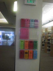
While visiting libraries I found myself dithering about taking handouts. As I analyzed this inhibiting feeling I discovered a few things. First that proximity to authority made a great deal of difference. If the handouts were located ON the desk, I was less likely to take one. If they were located (as the ones are in this picture-Provo City Public Library) away from the close supervision of librarians, I would take one of everything. (Ask me about my binders of handouts sometime).
Another factor was number of handouts available. If there were only a few, say 5 or so, I was less likely to take a handout for fear of shorting someone who really needed one. On the other hand, if it was a spectacular handout such as the "Squeaky Clean and No Caffeine" I'd take it anyway. So style/substance did make a difference. If it was more generic/informative I would leave it if there were only a few.
Lastly, and building on the above if the handouts were branded with the library logo/info in an attractive way I definitely wanted it. I was also fascinated by the different donor type brochures, though few libraries included these items in their general handout racks in the public areas.
In summary:
1. Make your handouts/brochures attractive and give them appealing or catchy names/titles.
2. Locate them in visible areas away from the official service desks.
3. Include the types for making donations/gifts to the library.
My two cents.
Jenny
Who never changed her behavior about taking handouts as she went along. Too worried that someone else might really NEED that last handout/brochure.
No comments:
Post a Comment