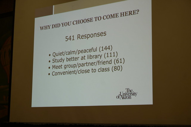
Akron University Library survey's the in building users simple coded paper survey, delivered by library student employees who they pretrained to deliver the survey. Surveys were returned to a drop box near the exit doors.
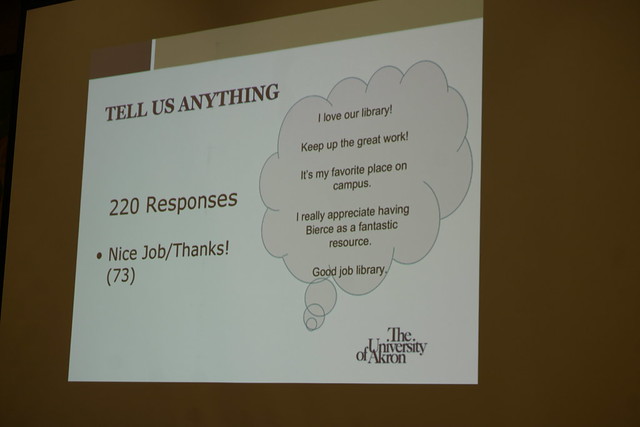
Results
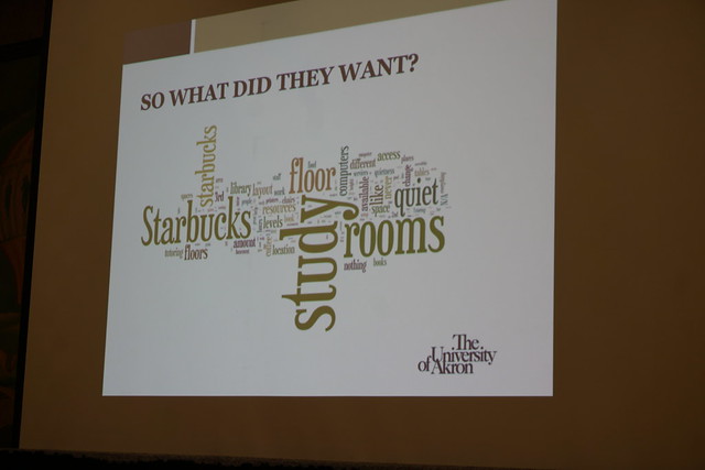
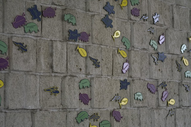
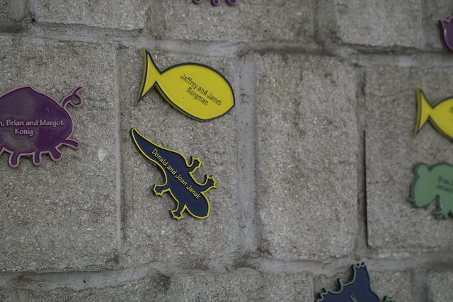
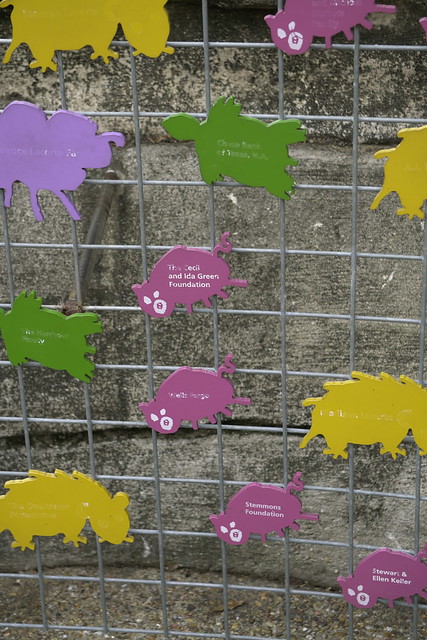
Used the survey to change things, refreshed study rooms, added comfy bean bag chairs, udpated charging stations, scientific calculators for checkout, mobile whiteboards. Also updated signage on quiet floor.
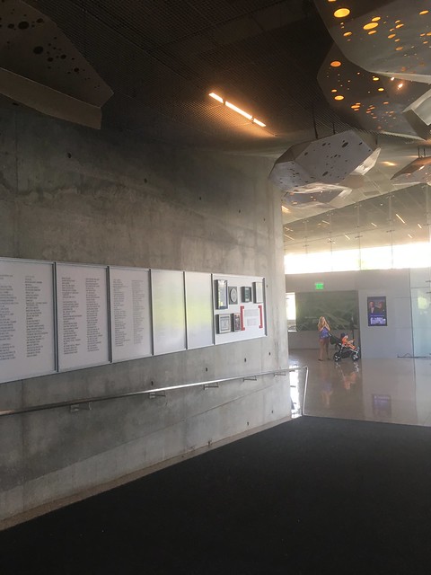
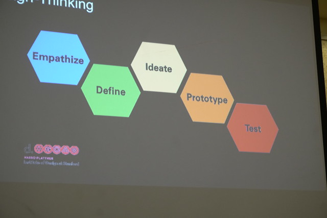
Human Centered Design for Building Signage
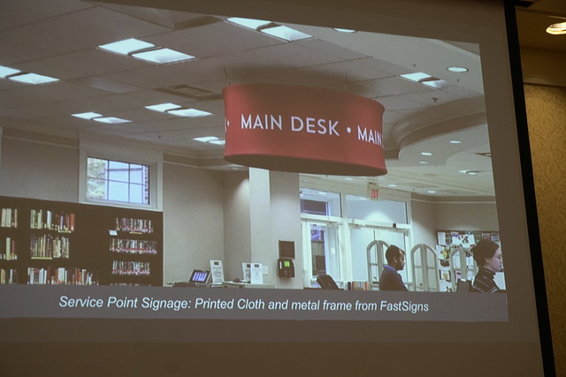
Library Lingo is not User Friendly Single service point titled "Central Services Desk" changed to
"Main Desk"
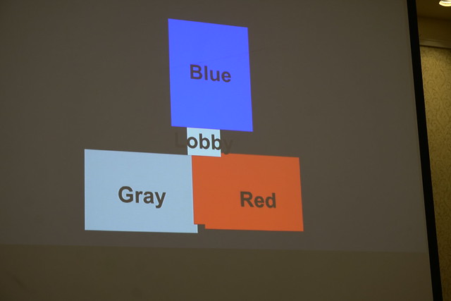
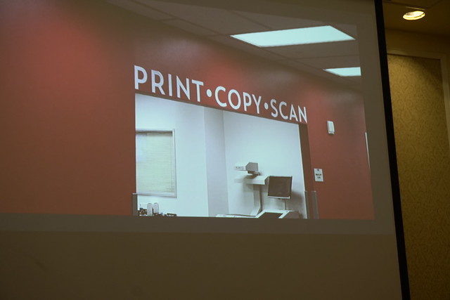
"Design is the silent ambassador of your brand" - Paul Rand Comprehensive design applied to signage at the Fondren Library: The building in color identified sectors
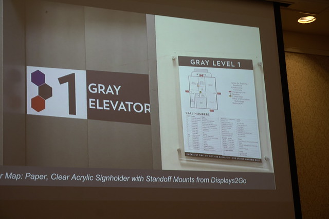
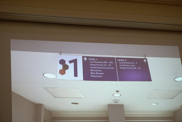
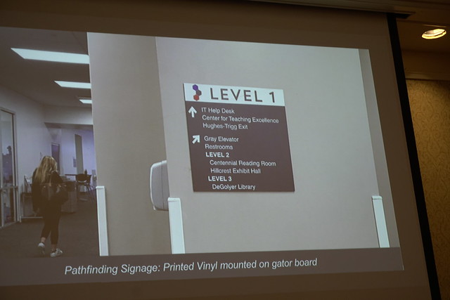
Elevator wrap with wayfinding floor map
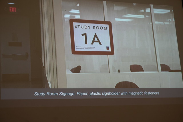
Color scheme applies to study rooms in specific buildings
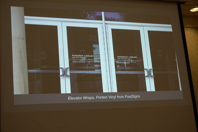
Front door vinyl
On color wall
Used Hexagon to match floor and desks More wayfinding
More signage used across buildings
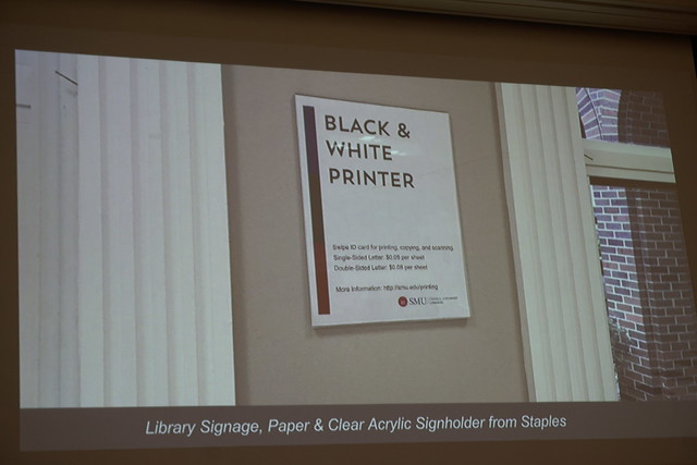
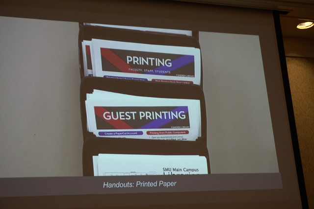
Handouts to match signage
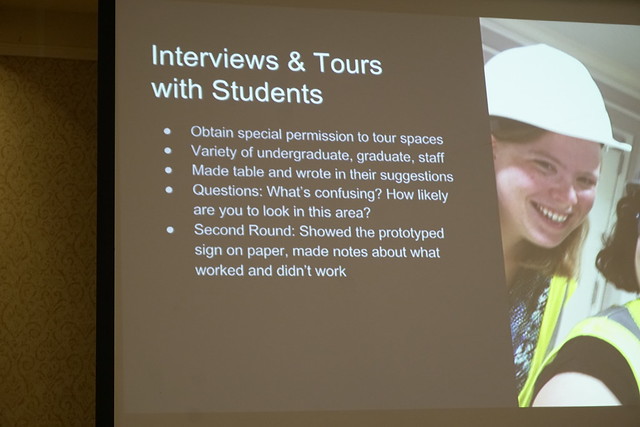
Walk through the building to find out how your signage works. Another wayfinding
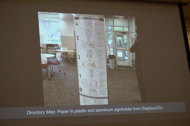
A comprehensive directory near the entrance
Always do a print test of font size and color
Less words = more likely to be read/used
Resources
Useful, Usable, Desirable by Aaron Schmidt and Amanda Etches
Service Innovation Handbook by Lucy Kimball
UX for the Masses website
Usability.gov
Guerilla UX Research Methods by Russ Unger and Todd Zaki Warfel
Don't Make Me Think by Steve Krug
Rocket Surgery Made Easy by Steve Krug